Theodore + Theodore Website Redesign
Role: Senior UX Designer (Information Architecture, Interaction Design, Visual Systems, Build & Implementation)
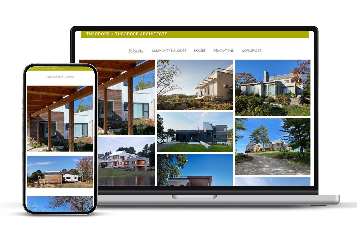
Product: Architectural portfolio website presenting a curated, chronological body of work in a near one-page experience
Context
Theodore + Theodore Architects wanted a website that functioned less as a traditional marketing funnel and more as a cohesive gallery and archive of their work. Nearing the later stage of their practice, the architects were interested in presenting their portfolio as a unified body of work—one that could be taken in holistically—rather than as a collection of individual projects spread across multiple pages.
The existing Drupal-based site was difficult to maintain, fragmented the work across many views, and no longer reflected the clarity, restraint, or craft that define the studio’s architectural practice.
Problem
The primary challenge was to design a digital experience that allowed visitors to quickly grasp the studio’s philosophy and range of work as a whole, without unnecessary interaction, explanation, or visual noise.
Key issues included:
- A scattered project structure that obscured relationships between projects
- Outdated imagery and content that diluted the strength of the portfolio
- A framework that was overly complex for the architects’ needs and difficult to maintain
- A digital presence that did not mirror the studio’s calm, contextual, and rigorously edited approach to architecture
Approach
Working closely with the architects, I designed and built a near one-page website that prioritizes continuity, proportion, and restraint. The experience is intentionally calm and non-linear, allowing users to scroll through the studio’s complete curated portfolio in chronological order, with the most recent work leading the narrative.
The design treats the website as a single architectural surface:
- Projects are presented together to emphasize how they interact as a body of work
- Imagery leads, with minimal supporting text, reflecting the studio’s belief that the work should speak for itself
- Visual hierarchy and spacing are carefully tuned to avoid overwhelm while still allowing depth on individual projects
- Performance considerations ensure only a portion of projects load at once, maintaining responsiveness without disrupting the flow
The site was designed mobile-first, embracing vertical scrolling as a natural, contemplative way to engage with the portfolio across devices.
Outcome
The redesigned site presents Theodore + Theodore’s work with clarity and confidence, offering a holistic view of the practice that aligns with how the architects discuss and review their work in person. By simplifying navigation and foregrounding the relationships between projects, the site reinforces the studio’s collaborative, detail-oriented approach and rural New England roots.
Built on WordPress, the platform allows the architects to easily update and maintain content themselves, ensuring longevity without technical overhead. The result is a quiet, enduring digital archive that reflects the rigor, restraint, and thoughtfulness of the studio’s architectural work.